Custom UIAlertView for iOS

It was a common pattern for iOS developers to create customised dialogs by attaching a subview to a standard UIAlertView. Since iOS7 however, Apple removed this feature and developers are left without a dialog pattern that matches the iPhone UI.

As a solution, I wrote an open source class to create an iOS8-style dialog which can be extended with any UIViews or buttons. The animations and the looks are copied too, and no images or other resources are needed.

You can just grab the open source code from Github now. In this article I will write about the implementation best practices and some background info.

Extend your current AlertView code to support iOS7 and iOS8

To create an AlertView with a custom subview, you probably wrote something similar to this:

And you did probably reset the frame in the delegate method willPresentAlertView too.

This was working on all previous iOS versions. On iOS7 however it will result in an empty dialog. What you have to do therefore is to fork the code here: display a standard UIAlertView on the old devices, and a CustomIOSAlertView on the new ones.

Forking the code is as simple as this:

For the new dialog, you would add something like the following:

Putting these two together, a full solution would look like this:

And that’s it! For the CustomIOSAlertView is a hack-free UIView, you don’t have to add anything to the willPresentAlertView delegate, just keep it as it is. For handling the iOS7 button clicks, you can use code blocks or delegates – please refer to the project’s readme.

How did we end up here?

Apple never officially supported the addSubview method of the UIAlertView. Their approach is to use this dialog only for a small subset of functions, like a plain text input. This is as easy to do as setting the style of the UIView to UIAlertViewStylePlainTextInput.

However, UI/UX designers like to use the dialog pattern for other use cases as well. An example is to show a simple image to the user, or display a progress bar while the user is waiting for a background download to be finished.

Until the previous iOS version the addSubView method worked fine, and developers used it as a best practice for these dialogs patterns. That’s why Apple’s move left app publishers in a bad position: before rolling out the updated version of our apps, in some cases we have to find a completely new user journey.

This is where the CustomIOSAlertView comes handy: we can roll out the iOS7-support quickly (and start up the user experience think thank in the background).

(Free code and source from Github. Opinions, debate: @wimagguc on Twitter.)
j j j

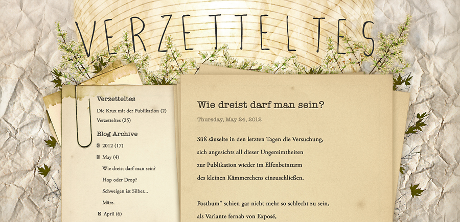
Redesigning Verzetteltes (on Blogspot)

If your girlfriend has an amazing blog, has more and more visitors every week, and you happen to be an UI guy, the least you can do is to make the blog look as pretty as its content – especially if you already promised to do so. Since our experiences might be useful to others running blogs on Blogspot, here are is a few words about the process.

A custom domain really is a must for all serious bloggers, so that was the first step. Since Blogspot (aka. Blogger) is a Google service, this was a rather easy part with a “next-next-finish” experience. That was actually the only thing we had to pay for, with the total cost of about ten bucks.

Before having any graphics done, we agreed on trying to keep the tools Blogspot provides to its users: widgets, social buttons for posts, tagging and so on. This introduces loads of constraints, but in the end, leads to a more flexible blog. Based on the current layouts I created a semi-template, and we started to design: with Katrin’s eyes and my hands we have put together some fine graphics in the end.

Because the already given structure and most of the markup generated by an unknown engine, for the sitebuild, the best approach seemed to be to use a template that is already available on Blogger. We have found one that was quite similar our layout, so I started the work based on that. With the help of Opera’s Dragonfly, the final CSS was done. Luckily I managed to avoid doing serious modifications on the DOM; keeping most of the original markup helped a lot in the integration process.

In the design we used a font that is not present on all platforms; to be able to use American Typewriter for the post headers without Flash, I used Cufon and some font support javascript that was already available for download somewhere.

As a final touch, I removed the Blogspot header as well. Now, I’m not sure if this was a legal move, but Verzetteltes looks much better without the blue strip, and there are a bunch of blogs on Blogger that are already doing that. In the worst case, I’ll be able to write about how to move a blog from Blogspot to WordPress as well.

For the image resources we added, we needed some online storage as well. For this purpose we used Google’s Picasa service – the few images we had easily fitted the free quota. All the JS and CSS content is wrapped in the HTML template, which is not the prettiest solution but seems to be a Blogger best practice.

Katrin’s blog is available at www.verzetteltes.com

j j j

Levitated interactions

The way we interact with the world is in constant change – for us, users, the best to do here is to adapt as fast as we can. No matter what the current technical development brings to our homes, we will push those buttons, twist the wheels and touch some screens.

Of course, sci-fi is always a step ahead: we have seen touch screens and something very similar to the iPad in futuristic movies from 30 years ago. But when it gets real and possible, it is a different thing. Or did you blink since you’ve seen the video above?

MIT created a very interesting user interface from levitating orbs. Placing balls in an empty place does indeed look amazing, and the rendered 3D video is crazy as hell – but the real power of this thing is in what user interaction designers think we could use it for.

I just can’t wait to see the first buttonless home stereos and washing machines – operated by levitating some orbs.

j j j