Drawing a weekly comic with the iPad

The first time I drew Frederique was about ten years ago, and since then, my preferred drawing technique didn’t change much: on paper, with ink or a black rollerball pen. As a disaster, I didn’t have access to a scanner the night the first episode should have been released, therefore I was forced to rethink my options – and I fired up the iPad.


From the first touch to the last: drawing on iPad, correcting vectors and finalizing graphics

There were of course plenty of other options: I could have reused my old drawings, or chose a more familiar digital tool like Photoshop or Illustrator. I wanted to go for something handmade though, and drawing with fingertips is quite similar to using a real pen – just that it has a built-in cheat, the option to correct the lines later. (But yeah, isn’t the eraser made for the same thing?)

This wasn’t the first time I used the iPad to do drawings though. I had a few goes with tons of apps, both raster- and vector-based. Because I wanted to have the comics in color, I went for the vector-based option, using neu.Notes+ (currently for 0.99$). This is a brilliant little app with great drawing tools and with a killer feature: it exports PDF files to Dropbox which can be directly fed into Illustrator from there – so that everything I draw with my fingers can be later edited with a professional tool that I use on a daily basis.


Tools optimized for touchscreens (neu.Notes) and trackpads (Illustrator)

Even with the already known tools, I’ve spent about 8 hours on the first episode: drawing, redrawing, checking on the computer, redrawing and finalizing the vectors on the iPad (unfortunately at this time, the PDF files cannot be transferred back), correcting the vectors in Illustrator, coloring, adding shadows and more details, and exporting the whole lot from Photoshop.

Since then I made ten episodes and some more images, practiced the finger-drawing and optimized the workflow a lot – now I’m down to around 4 hours per episode, which is about pen-and-ink-time. And there’s something even better to this process. Thanks to the vector-based graphics, I have a lot more options open: maybe one day we will see all these characters filled with life – and dancing in a cartoon.
j j j

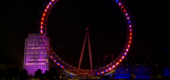
London Eye will be lit up by Olympic tweets

One of London’s most important landmarks got a spectacular decoration for the Olympics from EDF Energy: the lights will change their color according to tweets sent with the hash tag #Energy2012.


Lightshow and more info on edfenergy.com

The company developed an algorithm that filters tweets, and the more positive tweeps are, the more lights on the wheel will be lit. The highs and lows of the day’s major sport events, together with Twitter results will be displayed every night in form of a lightshow, between 9pm and 10pm on the EDF Energy London Eye.

j j j

Run, Forrest, Run (and track it)

Tracking runs and other sports is great fun, even if it means carrying another device. I got addicted to more data about my runs sometime last Summer, and tried half a dozen of apps since then. Now that the last update broke ‘My Tracks’ on my phone, it was time to look for a new one.

To look for a tracking app on Google Play is not easy though. There are hundreds of them out there, almost indistinguishable from each other and to make matters worse, I already have some preferences. They should be small, easy to use, easy to set up – and especially, don’t need any kind of registration or whatsoever. In fact, the less features the app has, the more I should like it: display the position on a map, measure time and speed – that’s all one can need.

I can’t really say why I did download Nike’s running app then. You have to register on nike.com before the first use. I don’t want to share anything on my Facebook wall. The app is huge. (16 MB, really? Will it do my runs for me?) And it’s not made by some nice indie developers on an island, but Nike, a giant. Yet, I did download it and tried it just now.

And I loved it!

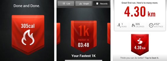
The registration is annoying. I don’t even know what a calorie is, but it keeps showing me how many less of those I have. It always wants to share my embarrassing results with my friends and followers. But there is something to it that I really liked.

Great graphics, for starters. And while I’m not at all interested in calories, I really do like how it is displayed, together with the longest distance, fastest run etc -it’s just great to look at those screens. The whole lot is perfectly made and has some spirit, some unique touch to it. And the best thing is: I can’t wait for the next time to use it.

This app is a brilliant lifestyle product. Nothing less.

j j j

Timelapse layer for Google Earth

To celebrate Landsat’s 40th birthday, Google made available a bunch of timelapse videos about Earth’s surface. With that, can watch the globe change over the last decade: the growing Las Vegas, the deforestation of the Amazon or the Aral Sea drying out. Amazing pictures and some food for thought.


more info and videos on Google Earth Engine

Google Earth Engine brings together the world’s satellite imagery — trillions of scientific measurements dating back almost 40 years — and makes it available online with tools for scientists, independent researchers, and nations to mine this massive warehouse of data to detect changes, map trends and quantify differences on the Earth’s surface. Applications include: detecting deforestation, classifying land cover, estimating forest biomass and carbon, and mapping the world’s roadless areas.

via 9to5Google

j j j

Evolution of the F1 Car

An animated timeline of all F1 seasons from 1950 to 2012, created by Rufus Blacklock. If you don’t like motorsports but have an eye for graphic design, you will still love this video.

Evolution of the F1 Car from Ruf Blacklock on Vimeo.

More infographics available on Rufus’s blog at biplaneblues.blogspot.de, as well as a list of sites that featured the video: among others it’s Engadget, Autoweek – and probably many, many more. Another reason to aim for the highest quality you can do.

j j j

Inspiration: Indie Game – the Movie

The first rule for using my computer was, not to play games. A bit later, to play only with those I wrote. Of course I cheated from time to time, but at least I had a few goes making them – only to gain enough experience to know that this is an extremely hard thing to do. Maybe this is why watching Indie Game – the Movie was so catching, but nevertheless, it’s great fun to watch these guys sweating blood and tears for success.

First-time filmmaking duo Lisanne Pajot and James Swirsky capture the emotional journey of these meticulously obsessive artists who devote their lives to their interactive art. Four developers, three games, and one ultimate goal – to express oneself through a video game.

You can watch the whole movie online at indiegamethemovie.com.

(In the meantime I get off the shelf my most recent game loop. Muwhahaha!)

j j j

The first iPad – from 2002

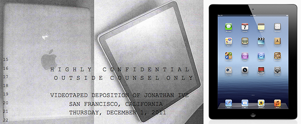
As a result of Apple’s recent patent wars we can see now some pictures about the first iPad prototype as it looked in 2002. A piece of history, and also a chance to see how an idea develops into a product before it finally reaches the market – in about a decade.


iPad then and now – more from the old video on NetworkWorld

“I’ll tell you a secret. It began with the tablet. I had this idea about having a glass display, a multitouch display you could type on with your fingers. I asked our people about it. And six months later, they came back with this amazing display. And I gave it to one of our really brilliant UI guys. He got [rubber band] scrolling working and some other things, and I thought, ‘my God, we can build a phone with this!’ So we put the tablet aside, and we went to work on the iPhone.” — Steve Jobs in 2010, at the All Things Digital conference

As for the patent war, I hope that brilliant minds keep chasing their ideas – and don’t mind that others use those to make their own products. In the end, being the only one in the market can be good from the business perspective, but having competitors moves the world forward in a much higher peak. A proof: Apple worked on the iPad for 10 years – for Asus, Acer, Samsung and others it took only a few to catch up.

j j j

Phones and updates

These are the best times for smartphone users: the choice on the market is beyond imagination, operating system vendors go crazy with their innovations and device manufacturers break their legs to deliver the newest updates for the devices. Or are they? I quickly collected some data about software updates to figure whether Apple, Google or Microsoft spoils their users the most.


Android, Windows, iOS – stunning looking UIs

Windows (Microsoft)

It’s certainly not Microsoft that has the happiest users nowadays: according to recent news, regardless of the fact that the Nokia Lumia phones are only 1.5 years old, they won’t be updated to Windows 8 – ever. And if this is not enough, there is an even bitterer pill to take: the apps written for the new OS won’t run on the “old” devices.

Microsoft has a good enough excuse for this, as they rewrote Windows from ground zero. It’s hardly satisfactory for the users though, especially those who bought the devices just now: they feel like Microsoft owns them at least an apology for knowing this all along – but deciding to be silent about it.

Android (Google)

If Windows users are unhappy, it’s because they have never waited for an Android update. Although Google is rolling out updates in a pace no one has seen before, hardware manufacturers are unable to keep up with them. The main reason for rolling out their own versions is that they want to differentiate their products on the market; for HTC for example, Sense is still a strong selling point.

Cold comfort it is for the ones with an abandoned device – some of which never actually had an up-to-date operating system. The Understatement blog has a list of the devices and their software updates from last year, and the picture probably even worsened since: only around 10% of current devices updated to even Ice Cream Sandwich yet, the one before Android version – which came out end of last year.

iOS (Apple)

For now it seems that iPhone users are the luckiest of them all, as Apple still sells the iPhone 3GS, a device that came out three years ago. Compared to Android or Windows phones, it might be true: even those ancient phones will be able to be updated to iOS 6, Apple’s new operating system introduced last month.

The future is not so bright though: while the operating system and the new UI shine is coming to all devices, some features will be missing on some older iPhones. According to the iOS 6 teaser page – among others – turn-by-turn navigation, Siri, FaceTime will be available only on iPhone 4S – and so it will be exclusive to the latest devices. The iPhone 3GS seemingly leaves out of almost everything.

Well, having the new Maps app is still better than nothing.

With all that, based on the updates only, if I would buy a new phone now I would consider offers in this order:

1. Android (Nexus devices only)
2. iPhone
3. Android devices from other manufacturers
4. Windows 8 phones

j j j

My first pizza dough

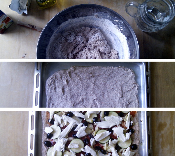
Another rainy afternoon spent inside, I decided to a make pizza – including the dough -, on my own. (And the Sun came out in the end!)


one shouldn’t take gastrophotos with a phone…

Being into healthy food and cooking to some extent, making my own pizza dough is something I wanted to do for a long time now. It’s cool. It’s tough. It’s a man’s job.

And it’s not that hard either. Following Jamie Oliver’s recipe – being unlucky with the video pages which were down at the time -, I managed to do everything in about 75 minutes. That includes cleaning the table in the beginning and cutting up the slices in the end, so I probably will do this again – and encourage everyone to try it once. As for me, the next step will be the Chinese boutsa from scratch.

Served with Syrah from Sicily. Bliss!

j j j

World Touristiness Map

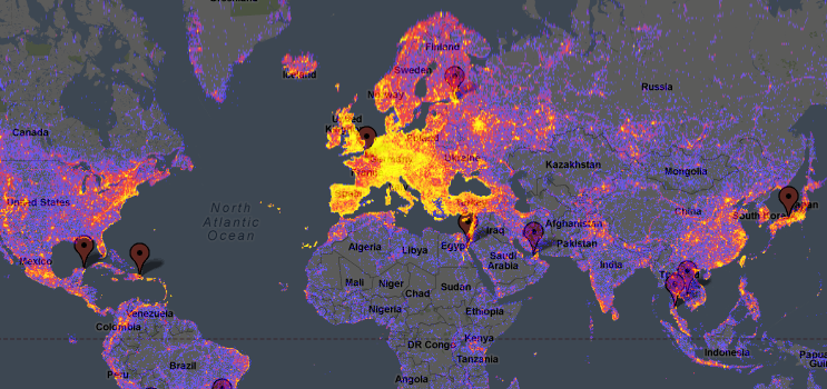
It’s the middle of Summer, when people either spend their holidays or are in offices, looking for holiday offers and places to visit. During my daily session of such discoveries I bumped into a map, collecting the world’s most touristy places – you may want to visit or avoid them, this map will be of use.


The map on Google Maps

The map has been created by Bluemoon, based on the meta tags of photos uploaded to Panoramio: “Yellow indicates high touristiness, red medium touristiness, and blue low touristiness. Areas having no Panoramio photos at all are grey. The analysis takes into account how many photos and by how many authors there are in a given area.”

How relevant it is for my search is hard to tell – probably not very. According to Facebook’s recent study on which social landmarks people visit the most, whatever masses think is worth visit is simply weird: what is there to see (or at least, check in for) at Kurfürstendamm?

j j j